In this tutorial we will help you to create a Full Responsive Table with the help of HTML and CSS.
To create a responsive table with CSS, the code is as follows −
<!DOCTYPE html>
<html>
<head>
<title>How to create responsive table in html</title>
<style type="text/css">
body {
font-family: "Open Sans", sans-serif;
line-height: 1.25;
}
table {
border: 1px solid #ccc;
border-collapse: collapse;
margin: 0;
padding: 0;
width: 100%;
table-layout: fixed;
}
table caption {
font-size: 1.5em;
margin: .5em 0 .75em;
}
table tr {
background: #f8f8f8;
border: 1px solid #ddd;
padding: .35em;
}
table th,
table td {
padding: .625em;
text-align: center;
}
table th {
font-size: .85em;
letter-spacing: .1em;
text-transform: uppercase;
}
@media screen and (max-width: 600px) {
table {
border: 0;
}
table caption {
font-size: 1.3em;
}
table thead {
border: none;
clip: rect(0 0 0 0);
height: 1px;
margin: -1px;
overflow: hidden;
padding: 0;
position: absolute;
width: 1px;
}
table tr {
border-bottom: 3px solid #ddd;
display: block;
margin-bottom: .625em;
}
table td {
border-bottom: 1px solid #ddd;
display: block;
font-size: .8em;
text-align: right;
}
table td:before {
/*
* aria-label has no advantage, it won't be read inside a table
content: attr(aria-label);
*/
content: attr(data-label);
float: left;
font-weight: bold;
text-transform: uppercase;
}
table td:last-child {
border-bottom: 0;
}
}
</style>
</head>
<body>
<table>
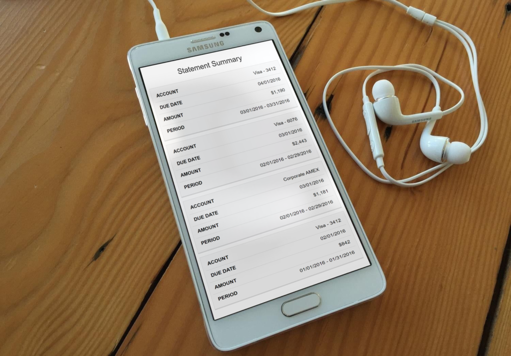
<caption>Statement Summary</caption>
<thead>
<tr>
<th scope="col">Account</th>
<th scope="col">Due Date</th>
<th scope="col">Amount</th>
<th scope="col">Period</th>
</tr>
</thead>
<tbody>
<tr>
<td data-label="Account">Visa - 3412</td>
<td data-label="Due Date">04/01/2016</td>
<td data-label="Amount">$1,190</td>
<td data-label="Period">03/01/2016 - 03/31/2016</td>
</tr>
<tr>
<td scope="row" data-label="Account">Visa - 6076</td>
<td data-label="Due Date">03/01/2016</td>
<td data-label="Amount">$2,443</td>
<td data-label="Period">02/01/2016 - 02/29/2016</td>
</tr>
<tr>
<td scope="row" data-label="Account">Corporate AMEX</td>
<td data-label="Due Date">03/01/2016</td>
<td data-label="Amount">$1,181</td>
<td data-label="Period">02/01/2016 - 02/29/2016</td>
</tr>
<tr>
<td scope="row" data-label="Acount">Visa - 3412</td>
<td data-label="Due Date">02/01/2016</td>
<td data-label="Amount">$842</td>
<td data-label="Period">01/01/2016 - 01/31/2016</td>
</tr>
</tbody>
</table>
</body>
</html> The above code will produce the following output in mobile −

You can also check this output into your mobile with below QR code

That’s all, this is how to create a Full Responsive Table using HTML and CSS. You can customize this code further as per your requirement. And please feel free to give comments on this tutorial.


